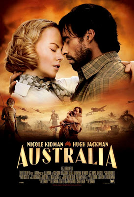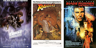
I love the sexy fused line of the KidJack profile but I reached this conclusion long ago: collages nearly always look cheap when photoshopped. If you want to include a several scenes from the movie on a poster you really need to enlist one of those oldschool illustrators like Bob Peak. He knew how to do. Witness...

Anybody who ever worked on designing a movie poster starring Harrison Ford (funny how that works) also fits this bill. Richard Amsel, John Alvin, Drew Stuzan etcetera... I realize artwork is passé for movie posters (and everyone loses for that) but surely studios should realize that if they must go collage -- if they positively must convey 36 things about the movie all at once -- illustration is the way to make it look iconic rather than awkward.

great poster sites for those that care about such things: IMPA, Film Posters and Poster Wire


10 comments:
Doesn't the collaged poster style kind of go with Luhrmann's hyper-synthetic and cold editing style?? :o)
Hey! .... OUCH!! Nathaniel, quit throwing darts at my neck!
The thing that creeps me out is their ever-so-slightly-opened-mouths. "Just a little more, Ms. Kidman...NO NO NO! TOO MUCH! TOO MUCH!" But hey, that trailer runs every gamut in the book. Why not make the poster the same. At least its consistent!
I dunno... I still see Cold Mountain part deux.
That poster reminds me of some of the posters from Gone With the Wind.
Check the 1998 video one-sheets for Gone with the Wind:
http://www.imdb.com/title/tt0031381/posters
To me, Hugh Jackman just looks better and better and more romantic with each new photo. He looks like a perfect romantic hero. (and remember Cold Mountain had Jude Law - not so hot - and the lovers were hardly ever together).
And Nathaniel is right. The photoshopped parts look flat and thrown together.
I just cannot feel this movie, in any of its PR or preview manifestations. Hopefully, I will feel the actual movie.
why does her forehead look humungous?
EMBRACE THE FOREHEAD ;)
some people have larger ones than others
I am more than excited about the movie itself and I truly think it will be mind - blowing (I adore Baz and can´t wait to see Nicole Kidman and Hugh Jackman). But this poster is not so outstanding that someone would say "Wow, that looks fantastic. I have to watch this". The poster is good, and I find it cute and beautiful that the poster itself has this old Hollywood Style of movies like "Gone with the wind" and "Casablanca", where the focus of the poster was on the main actors/characters.
But for today it should have a bit more of a wow - effect.
Post a Comment