All images are courtesy of AwardsDaily unless otherwise noted.
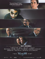
 As the undisputed zeitgeist movie of the year, The Dark Knight is gearing up for a big Best Picture campaign and I figured it was a logical place to start. The film has already amassed a large FYC catalogue of eight (and that's just in the trades) compared to other highly-touted titles: The Curious Case of Benjamin Button with three, Doubt with four and so on. Even I, not a die hard fan of the movie, must admit that the ads are by far the best looking. At least as of right now, anyway. Australia's campaign is sure to be beautiful if Fox gets off their arse and creates one, but who am I to demand such a thing? Whoever is designing these ads for Warner Bros sure does know what images to use and how.
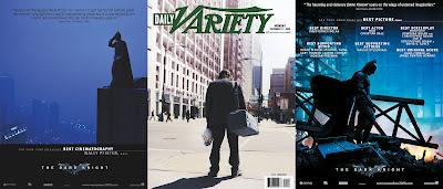
Taking the "serious" route with the campaign, the ads for The Dark Knight are all dark and brooding. Filled with eye-catching blues, saturated blacks and searing whites. That Best Cinematography nomination for Wally Pfister is looking more and more like a possibility as more gorgeous ads get released (which, in an aside, doesn't actually mean anything in terms of whether the cinematography is worthy of a nomination, does it?) particularly when they are as eye-popping as the one of the left here.

So pretty! If only all ads worked that well!
FYC Ad of the Week: Tropic Thunder
Yes, yes, by now it's circulated the 'net and been praised to infinity (and beyond?), but it still bares repeating.
I found this particular ad at Film School Rejects amongst other places and it's a hoot! At least somebody's having fun with their campaign!


5 comments:
Australia has a couple of FYCs on Awards Daily - and they are gorgeous.
omg glenn. Somehow I had not seen the Tropic Thunder ad. So funny.
I agree that the Dark Knight ads are classy but I wish they had a little more of the creative verve that the movies initial teasing ad campaign had. I totally blame that movies huge 'bestmovieofalltime' reception to its brilliant marketing campaign that worked people into such a frenzy that theycouldnt even see straight afterwards.
it's taken months for example for some diehard fans to notice the plotholes and even then, they just don't care.
Great entry, Glenn! For me the most evocative still from TDK is the center image in your trio, that first shot of the Joker in the film. Something about the way he's standing. The first time I saw TDK I got a chill at the realization that "it's HIM", and I still feel a similar chill whenever I see that image. Or maybe it's just winter setting in.
Nathaniel's right (of course!), these ads are not the most creative, but perhaps there's something to be said about an ad that brings one back to the feeling one had experiencing Ledger's terrifying performance.
HAHA I found a Tropic Thunder FYC video. This campaign is way too brilliant.
http://www.traileraddict.com/trailer/tropic-thunder/consideration-kirk-lazarus-2nd-version
The Australia posters at FYC:
http://www.awardsdaily.com/FYC/gallery/2008-09/photo.php?id=1279
and
http://www.awardsdaily.com/FYC/gallery/2008-09/photo.php?id=1291
Pretty, yes, but you'll notice all faces are in silhouette (using images that weren't included in the film, in the case of the "porch" image.) I think these ads reflect the fact that Fox knows it doesn't have a chance in the acting catagories. Cinematography is a shoo-in for a nom, however.
Post a Comment