As anybody who reads my blog is that I have a mild obsession with movie poster art. The good, the bad, the very bad and the occasionally deranged. One of absolute favourite key art designers is Jeremy Saunders (his official site) who is an Australian designer. His poster work tends to be for Australian films or Australian exclusive versions of international films.
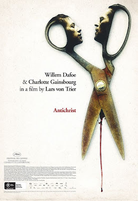
Recently on his Twitter feed he started going on about "the best poster design he's ever done" and "Praying (to whatever) that @lars_von_trier approves my poster for the Australian release of Antichrist". While I'm not sure if Von Trier accepted it, but he posted the poster on his website and I thought, considering the number of people who want to see this movie desperately, I'd share it.

As anybody who has seen the film (such as myself) can attest to, the image represented on here is... somewhat apt. I do like to imagine this hanging up in the local arthouses and having some unsuspecting
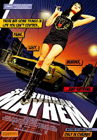
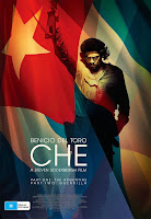
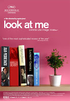
And just to spread the word of Jeremy Saunders here are some of his most amazing work for you to drool over. Aah, the beauty of it all.


14 comments:
Loves the Antichrist poster. However, Lars' name is rather small. Doesn't he usually have his name bigger than the stars?
Ugh, he must be such a nightmare to work with, no?
I LOVE that Antichrist poster. And the others are amazing as well... have been admiring the Suburban Mayhem artwork for years.
Did you dislike the film, Glenn? I thought it was quite good - tought to watch, a bit gratuitou and occasionally awful but also incredibly memorable and often absolutely breathtaking in its direction and performances. Not at all the "career-killer" some are predicting. It is a flawed film but one that I think will be critically reappraised with time.
I did like it, Slayton.
Wow! I like the Good Night, and Good Luck poster.
I must say, I really don't like that Antichrist poster. The bluntness and literalness is a touch to comical to me. I mean blood seeping out of the "crotch" of the scissors? LOL.
The others are great, though!
I have to admit. I'm a little afraid to see this film...
I'm a little weirded out by how "Weimar" the GNGL poster is.
I think the poster looks great. Very interesting, its like the only way the faces can kiss is if the scissors cut something. I dont know, thinking out loud. I didn't realize the blood was coming out the "crotch", I guess anything involving the crotch region in the movie shouldn't surprise me now. I heard a lot of mixed responses on the movie. I dont know whether its because its very graphic and disturbing or they just think its plain bad, hope not.
Not a huge fan of the poster but loved the movie.
The 'Look At Me' poster is one of my faves though.
Those scissor faces are super-intriguing and creativly bizarre.
It's got to be hard designing posters when you make something amazing and instead they opt for the giant head siloutted over green fields with the actors names real big.
Thanks so much for this post and pointing out Jeremy's work (love the Antichrist poster)!
At the advertising agency where I work every week we have a kind of "inspiration" session where someone shares design work, art and assorted other creative material that inspires them. Naturally when it's my turn I'm doing movie posters:)
i love these posters, particularly Look at Me.
honestly i feel like the citizens of the world should rise up and destroy all giant floating head posters from here on out.
Post a Comment